In the first part of our “think like an analyst” series, we discussed a basic, 4-stage data aggregation pipeline for analytical purposes. In this article, we show the limitations of such a model when applied to real-life cases and the kinds of data transformations needed or desired to build informative reports.
A core tenant of our work at Statwolf is that all the desirable data transformation functionalities should be available within the platform itself – at no point should the user feel the need to download their results in Excel format and run further analyses. While it is true that Excel runs the world, and pretty much everyone is at least somewhat proficient in its use, it is also known to be quite prone to errors with its cumbersome processes, sometimes with literal world-changing consequences.
A Real-Life Reporting Use Case
A common task for marketers and analysts all over the world is to evaluate whether the money allocated to paid advertisement is well spent (and if you are not doing this, you should start). These analyses can range from very high-level analyses (e.g. monitoring the cost per click and/or conversion across all the running campaigns) to specific investigations into user segmentations and individual ads – needless to say, the real potential lies in this latter category.
Let’s say that for instance, we are analysing our Facebook Ads campaign efficiency grouping by campaign objective. For the uninitiated, Facebook will optimize the display of your ad campaigns based on the selected Objectives - choosing wisely is a great way to differentiate your ads and reach your audience more thoroughly. Speaking of audience, demographics can play a big part – targeting can make or break the ROI of a campaign and the data-driven marketer needs to pay attention to it.
For your sample analysis, let’s settle on using Objective and Gender as dimensions, and the three most basic metrics – Impressions, Clicks, and Spending. Running this analysis through the 4-stage aggregation builder yields accurate, but somewhat unsatisfying results:
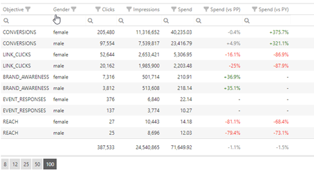
While the results returned by the platform are exactly what was asked for, from this representation, it is hard to understand which components of the analysis are driving the results – for instance, which Objective is driving the most overall clicks. We could run two separate queries (one for Objective only and one for Gender only), but we would then miss the drilldown information. What to do?
Option 1: Pivot Table
Enters the concept of Pivot tables – by pivoting, it is possible to define an order for the selected dimensions and to obtain a nested representation with subtotals for each group. In the Statwolf platform, this is as easy as a drag and drop operation:
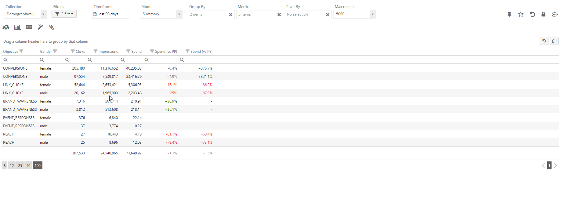
We can observe that the pivot operation is creating new rows (the subgroup rows), which contain the partial metrics for a whole subgroup. This way, it is possible to read the analysis from the outer to the inner layer and gain more information progressively. The user can then interactively create multiple nested layers of pivot analysis as well as alter or change their order.
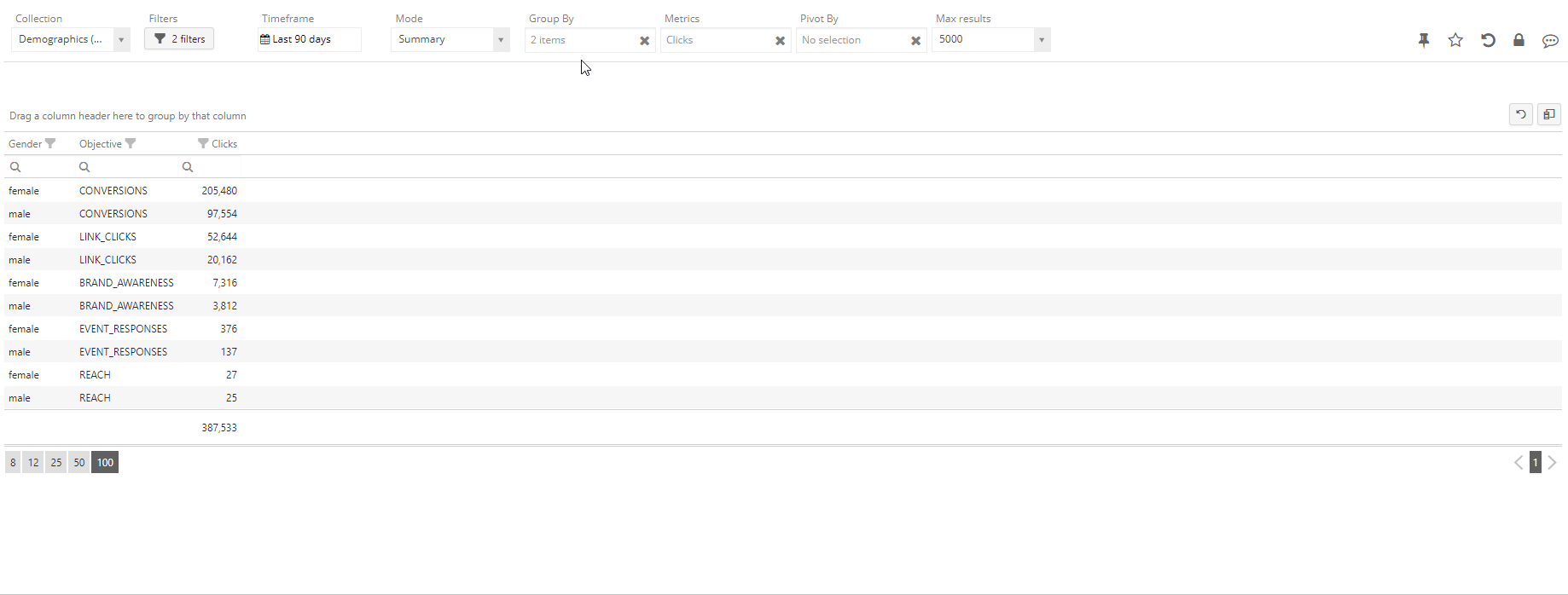
Option 2: Crosstab
Sometimes it is more desirable to keep a flat structure in our result (without nesting) and map one of our dimensions into a new set of metrics – for instance, keeping only Gender as a dimension and have one Clicks metric for each possible Objective. This can be achieved by using the “Cross by” functionality:
Pros And Cons
Both presented techniques have their advantages and disadvantages (and they are not mutually exclusive!). Specifically, you should use the Pivot approach when a drill-down approach (from more generic to more specific) is needed; conversely, the Crosstab is useful when comparing various segments against each other, while also looking at the whole picture. The most straightforward way of comparing the two techniques is to conceptualize it like so: Pivot is going to create new rows, while Crosstab is going to create new columns.
In conclusion and as usual, there are no silver bullets to data analytics – learning the strengths of different analysis modes and data transformations, as well as being supported by a flexible platform, is the most efficient path towards easier and more informative reporting.