Data scientists can be confronted by different types of challenges along the journey of finding actionable insights from data. According to Business over Broadway, such challenges are also related to dirty data, like the tools that are used to extract insights and deploy models, as well as scaling solutions up to the full database.
StatwolfML was born with the aim of providing data scientists with a tool that overcomes such typical challenges and allows the application of machine learning algorithms in a more effective and efficient way.
In this series of articles, we’re going to focus on using StatwolfML:
- To explore, visualise, and clean your dataset
- To define, test, and compare various machine learning pipelines (e.g. pre-processing methods, features engineering, machine learning algorithms)
- To setup your machine learning dataflow and apply it in a real environment
An Overview of StatwolfML
Using json, StatwolfML is a data science and machine learning oriented framework. StatwolfML has been developed with declarative syntax, so that no code needs to be written. Instead, you can easily set up your own specific requests to the dataset, such as data cleaning, feature engineering, machine learning algorithms, etc. In addition to that, users can also add a specified output. For example, things like figures, statistics, accuracy metrics, and others. The StatwolfML framework has a plugin architecture, which makes it easy to add features and extend your user-interface.
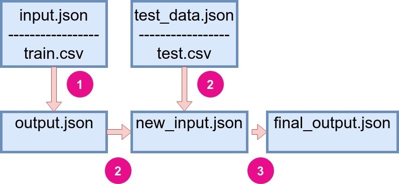
Let's have a look at the framework structure. There are two .json files containing user instructions:
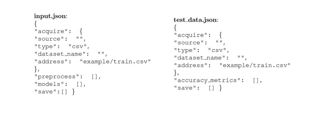
- input.json, which contains information about how to get a train dataset (path, format etc); pre-processing functions, machine learning algorithms, and exploitative methods.
- test_data.json contains the information about test dataset, accuracy metrics, and output instructions.
 |
|
Figure 1: General StatwolfML flow. |
The .json files have the following structure:
We can define three main steps in which the flow is run:
- The code is run with the input.json file on a train dataset and creates an output, which is also a json file.
- Output from the previous step is combined with test_data.json file and new input.json is created.
- The final run is made with new json file and the final output file is created. The final output may contain the predicted values, plots, statistics, etc.
Once the two json files have been configured by the user, StatwolfML will automatically handle the workflow. For example, it will apply the defined pre-processing methods itself, ultimately taking care of postprocessing data accordingly.
An Example: The Titanic Dataset
In order to more effectively explain just how the StatwolfML works, we will be using the Titanic dataset. We chose this dataset due to its simplicity: not much feature engineering is required, missing values are easy to handle, and it is a binary classification problem.
We performed the analysis on the Titanic dataset following an online available notebook that aims to understand what sorts of people were likely to survive the shipwreck. This is a binary classification problem where the output variable is Survived/Not Survived. In the following sections, we will discuss in detail the concept of StatwolfML and how to use it. In particular, how to acquire the data, pre-process it, and apply machine learning models.
Let’s Dive Deeper Into The Dataset
On April 15 1912, the Titanic sank after colliding with an iceberg. This led to 1502 deaths out of 2224 passengers and crew. One of the reasons that the shipwreck led to such loss of life, was that there were not enough lifeboats for the passengers and crew members to abandon the ship safely. Although there was some element of luck involved in surviving the sinking, some groups of people were more likely to survive than others, such as women, children, and the upper-class.
We've got the data about passengers who were on board that night and it was already split into train and test datasets respectfully. The train.csv file is used to build machine learning models. The test.csv is used to see the performance of the models on the unseen data.
 |
|
Figure 2: Titanic catastrophe |
In the next section we will start building a .json file, which will be run into the StatwolfML Explore framework. In fact, the first thing we need to do, is explore the dataset in order to get a better idea about how the columns, variables, and their distributions will look like.
Data Exploration Using StatwolfML
The general structure for the input file into StatwolfML is as follows:
{
  "acquire": {},
  "preprocess": [],
  "models": [],
"save":[]
}
Then, we need to fill in the acquire section, specifying where and in which format we get the data:
"acquire": {
"source": "filesystem",
"type": "csv",
"dataset_name": "titanic",
"address": "example/titanic/train.csv",
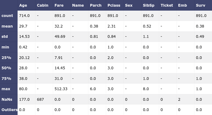
"index_col": 0}For this phase, we leave the pre-process and models sections empty and fill in only the save section. First, we want to take a look at the statistics of our dataset, i.e., the number of elements, their mean and std, number of null-values for each column, and possible number of outliers. This is done through the following declaration:
"save":[{
    "outcome": "filesystem",
    "format": "csv",
    "transform": "statistics",
    "path": "temp/titanic_statistics.csv"
    },...]
According to the StatwolfML syntaxes, the statistics will be saved in a file with .csv format.
The result is the following:
 |
|
Figure 3: Basic dataset statistics |
We can see columns "Age," "Cabin," and "Embarked" have NaN values and none of the columns have the outliers.
Note that such outliers are computed as a standard deviation error, i.e. the data is assumed to be normally distributed. If this is not the case for your dataset, we recommend that you use other methods. In StatwolfML there are several models for outliers and novelty detection for different distributions. For example, we have:
- One-class SVM (which stands for Support Vector Machine). It is a type of unsupervised algorithm for novelty detection. It learns a decision function, ultimately classifying data as similar or different to the training dataset.
- Minimum Covariance Determinant. This algorithm works well on Gaussian-distributed data, however, it can also be applied on any unimodal, symmetric distribution.
- Customize outlier identification. User can specify a supervised model and the rate, which defines the percentage of outliers one wants to remove.
If your data is normally distributed and you want to know exactly which points are the outliers, you can add the Mahalanobis function to your flow - a function that computes Mahalanobis distances. All of these models will return a column, where, for each point, a value -1 or 1 will be set for outlier and non-outlier respectfully.
Visualisation With StatwolfML Explore: Countplots
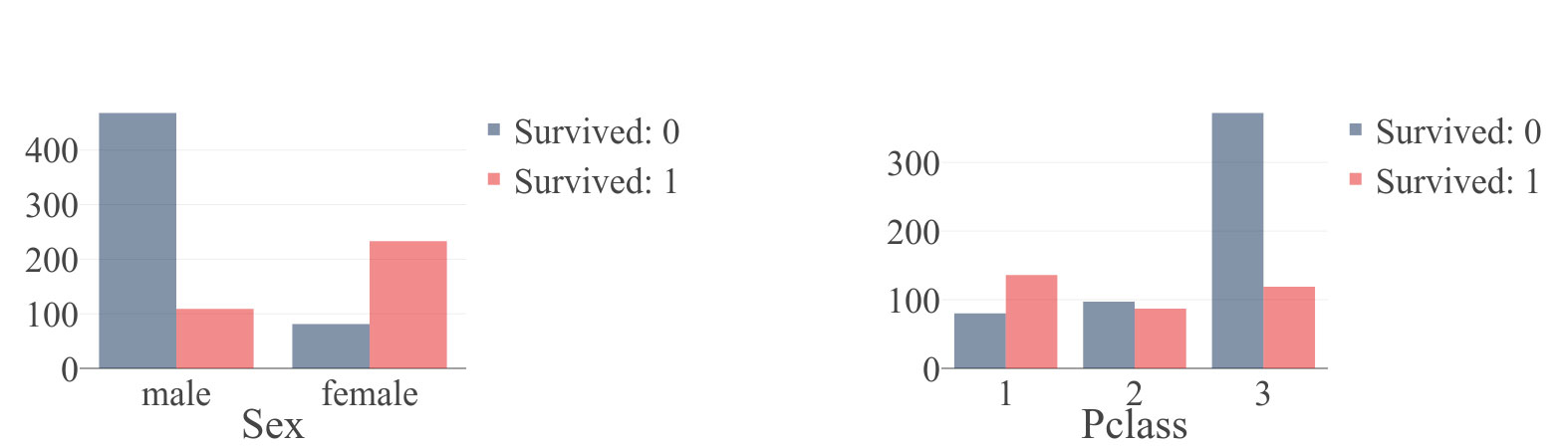
To better understand the Titanic problem, we decided to add two countplots. Countplot is a type of bar plot that is useful when the user wants to estimate the number of observations in each category. Countplots allow us to depict the number of survived/non-survived passengers and crew members for different genders and different classes. This will, again, be added to the save section.
"Sex" column:
{
    "outcome": "filesystem",
    "format": "json",
    "transform": "plotly",
    "path": "temp/titanic_sex_survived.json",
    "figure": [{
        "chartType": "countplot",
        "x": "Sex",
        "hue": "Survived"
        }]
    }
"Pclass" columns:
{
    "outcome": "filesystem",
    "format": "json",
    "transform": "plotly",
    "path": "temp/titanic_plcass_survived.json",
    "figure": [{
        "chartType": "countplot",
        "x": "Pclass",
        "hue": "Survived"
        }]
    }
Let's take a closer look at the parameters:
- Outcome, format, and transform are set to "filesystem," "json," and "plotly" respectfully. This means that we will store a plotly object in a .json file, the address of which is specified in a path.
- In figure, we need to set chartType to "countplot," the observation variable should be set to x and the categorical variable should be set to hue.
- You can specify other parameters for the figure, too; for more details, please check the StatwolfML documentation.
After running the code, the files are ready to use. If you use the Jupyter notebook, the code for plotting the figure can be written as follows:
import json
from plotly.offline import iplot,init_notebook_mode
init_notebook_mode(connected=True)
with open('/temp/titanic_sex_survived.json')as f:
    out = json.load(f)
iplot(out)
And the resulting figures are:
 |
|
Figure 4: Countplot for (a) "Sex" column and (b) "Pclass" colummns generated by StatwolfML. "Survived" column takes values 0 (didn't survived) and 1(survived). |
On Figure 4 we plot the resulting countplots: “Sex” and “Pclass.” You can see a correlation between “Sex” and survival rate. The percentage of survivals among women is much higher than among men. This same principle applies for “Pclass”: passengers from the first class have a higher survival rate than passengers from the other two classes.
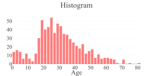
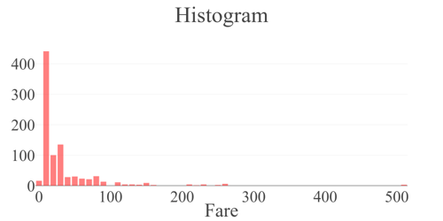
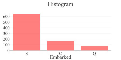
Visualisation With StatwolfML Explore: Histograms
In a manner similar to countplot, the user can decide to produce histograms. We won't be going into detail here since the declaration is very similar to the countplot:
{
    "outcome": "filesystem",
    "format": "json",
    "transform": "plotly",
    "path": "temp/titanic_age_hist.json",
    "figure": [{
        "column": "Age",
        "chartType": "histogram"
        }]
    },
{
    "outcome": "filesystem",
    "format": "json",
    "transform": "plotly",
    "path": "temp/titanic_fare_hist.json",
    "figure": [{
        "column": "Fare",
        "chartType": "histogram"
        }]
    },
{
    "outcome": "filesystem",
    "format": "json",
    "transform": "plotly",
    "path": "temp/titanic_embarked_hist.json",
    "figure": [{
        "column": "Embarked",
        "chartType": "histogram"
        }]
    }]
Hence, we declared histogram plots for the "Age," "Fare," and "Embarked" columns.
Let's take a look.
 |
 |
 |
|
Figure 5: Histogram plot generated by StatwolfML for the (a)"Age", (b)"Fare" and (c) "Embarked" columns. Column "Embarked" takes three values: C = Cherbourg, Q = Queenstown, S = Southampton. |
Now, that we have some idea about the dataset, i.e., number of records, number of NaN values, distribution of some features, etc, we can go to the next part, which is the pre-processing.
So What?
In this post we have described the declarative syntax of StatwolfML, and how its data flow is designed to reflect and adapt to any machine learning flow.
We have shown just how to perform some basic operations for data exploring:
- The statistics command allowed us to easily discover NaNs and outliers.
- The plotly integration allowed us to quickly visualise our findings.
These functions make the lives of the data science much more effective and efficient, especially when he/she approaches a new dataset.
Obviously, we could not cover the complete list of commands, features, and charts available in this brief article. But of course, if you’re interested in that, please refer to the Complete StatwolfML Documentation Guide (that is updated very frequently).
In the next blog post, we will learn how to apply what we found during the data discovery on our dataset, in order to make it ready for machine learning.